PORTFOLIO
Gallery of work history

This is a piece of development work for the typography project as I started with this colour palette and this made me understand the importance of the colours and what it makes the audience feel and the mood it portrays

Typography project
Using Adobe Illustrator I created this A3 design with the aim of it being a typography poster for the Calibri typeface, built and layered from a grid that I created from a photo I took from around my college. The choice of colours purely to show the most drastic contrast possible which helped emphasise the layering and making the important layers the focal point.

Development and outcomes of a current trends project
This work was created from a summer project on Illustrator. As the theme of my personal investigation was 'Graphic Design and Music' I decided the posters would be in a square format 297x297mm like an album/LP cover. Testing different current trends at the beginning of the personal investigation helped broaden my view of different ways to create my work throughout the investigation.


Type and legibility
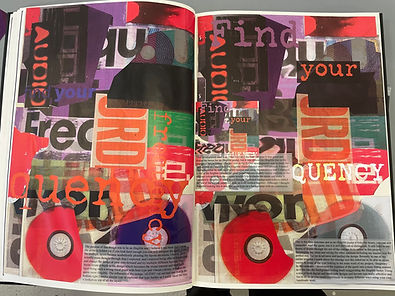
This project was developed off of a lot of research on what makes a design legible or illegible. The outcomes are A3, the legible poster made on illustrator and the illegible outcome made with a mix of both illustrator and photoshop. The "find your frequency" quote was from further research; having to find quotes relating to my personal investigation theme of Graphic Design and Music.

Above is my legibility outcome with the aim of being easy to read and a simple but well displayed message relating to my investigation of Graphic Design and Music with the digital music flow creating a modernist design. This is an A3 poster created on Illustrator
Development screenshots of my illegibility outcome

Experimented ideas of a legible outcome
Below is my outcome for the illegible side of design, A3 also, working from my handmade collage which was picked apart and edited on illustrator creating a mixed media and heavily layered design and hiding the quote in the layers; hiding the title in plain site
Magazine project
Creating the magazine, I used Photoshop and Illustrator and the magazine is A4 sized, the contents of the magazine are designs I chose that I had developed and finalised throughout the two years the course. These were then edited and developed to fit the format and theme of my magazine, the theme still being music. and this becoming the way I create a continuous theme throughout my magazine with the appearance of a music note on each of the inside pages. Layout also, was thought about and researched excessively making my magazine flow to the human eye.
Magazine development pages


Personal investigation
outcome development

This sketchbook page is just one of the research pages and experiments for my outcome, this experimental work was developed up from one of my earlier works which also used figures as shown in the centre of the page. This works aim was to experiment with figure work and gradient maps and which areas on figures need to be emphasised to create the best design.

Working on lots of different designs for my outcome gives me the freedom to use lots of my own photographs. This design was built from the same idea of the background behind the isolated figure being wavy and trippy which emphasises the figure as Aichers work did. Working the type and shapes to create layers and a depth to the design; making the text flow with the background which made the normal form of the figure stand out in the design. As also I had simplified the figure into flat colours simplifying the dark and light areas which formed the figure.

This design is worked from a picture of mine on photoshop, it is close to becoming one of my final outcomes but it still needs some development. This is designed to be a house music poster for a rave and working off influence from Otl Aichers figure work, I developed it with my own influence using gradient maps to create strong contrasts of the light and dark areas of the figures and creating a trippy background which was aimed to create a connection with the target audience of this kind of poster.
